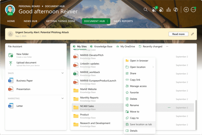
Get ready for an even better experience with the latest enhancements to our App Launcher widget! We’ve been busy fine-tuning your digital workspace, and we’re thrilled to introduce some significant improvements that will simplify how you access and interact with your apps.
New layout options
One of the most exciting enhancements is the introduction of new layout options. We understand that everyone has their own preferences when it comes to organizing and accessing their apps, so we’re giving you even more flexibility.
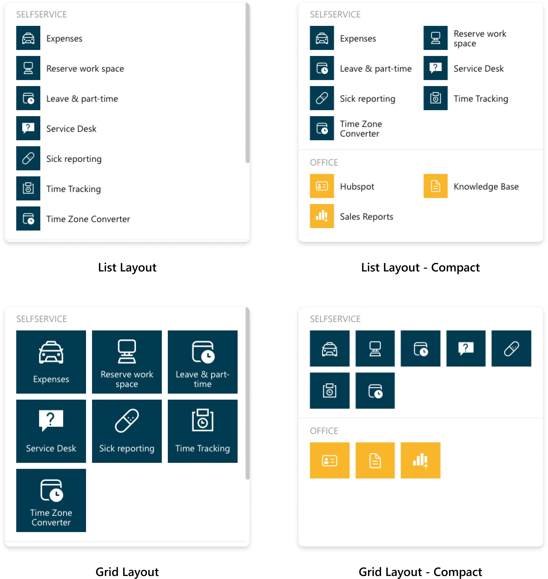
With the addition of a new List layout and a Compact spacing option for both the new List layout and the Grid layout, you now have four distinct ways to view your apps within the App Launcher.
Here’s a peek at the four layouts:
Improved fly-out behavior
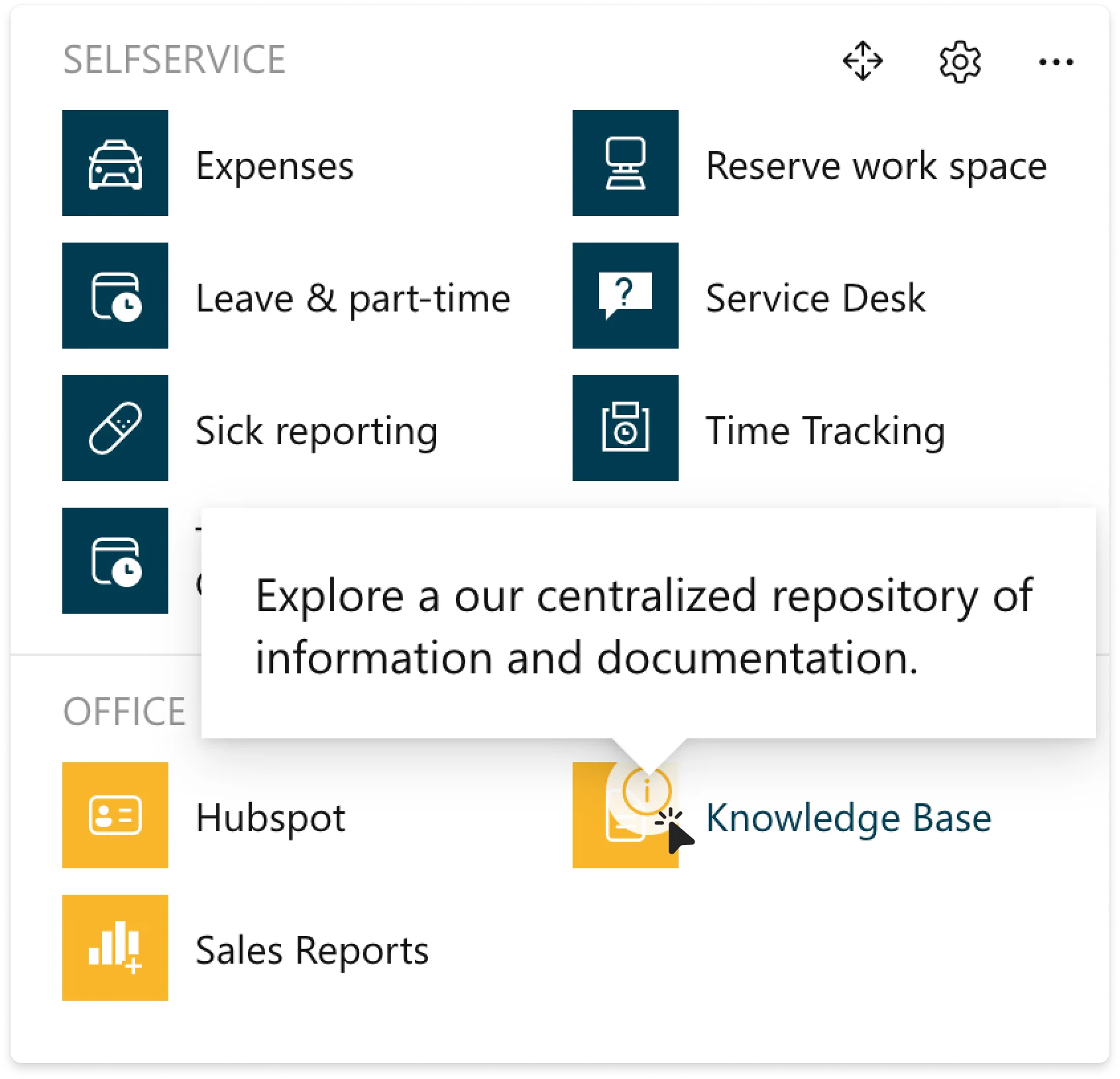
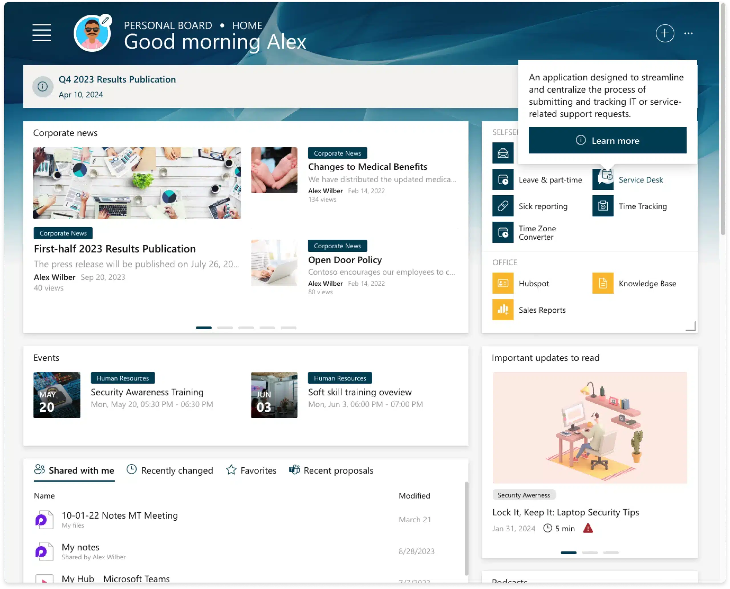
We’ve also revamped the behavior of the fly-out. It’s now considerably less intrusive but still displays relevant information about an application if available.
The fly-out will only be displayed on the new information icon that appears when you hover over the app. This way, users unfamiliar with an application can dive into more details if needed.
Here’s how the new hover style looks:
Conclusion
We believe these updates will significantly enhance your experience with Ichicraft Boards. As always, we’re eager to hear your feedback.
Let us know what you think!

